
Mid-afternoon in the Cafe
Illustration
LGBTQIA+ Little Free
Library Illustrated Sign
Kitchen Chaos: Making
Salad Illustration
Moreish Magic of Maggi
Editorial Mockup

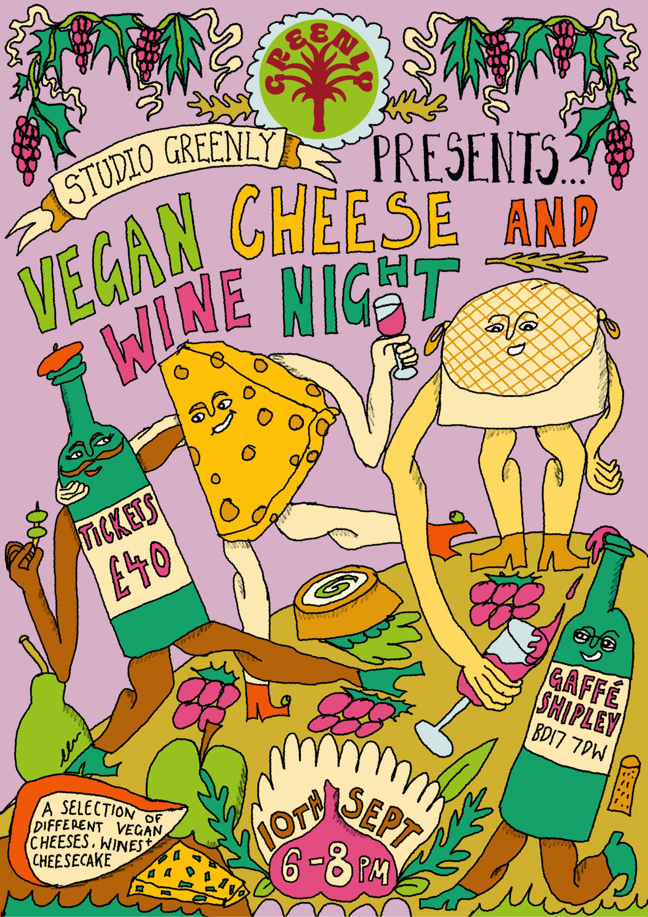
Vegan Cheese and Wine
Night Illustrated Poster
Ruby in the Garden
Illustrated Poster
Yes! Definitely Water
Bottle Label
Kae Tempest for
Loud and Queer Project

In the Garden Illustration

Juno Books Gift
Card Design
Plaktivat Poster Design-
Make Better Choices
Illustration for Hairdresser
That Emelya Does Hair

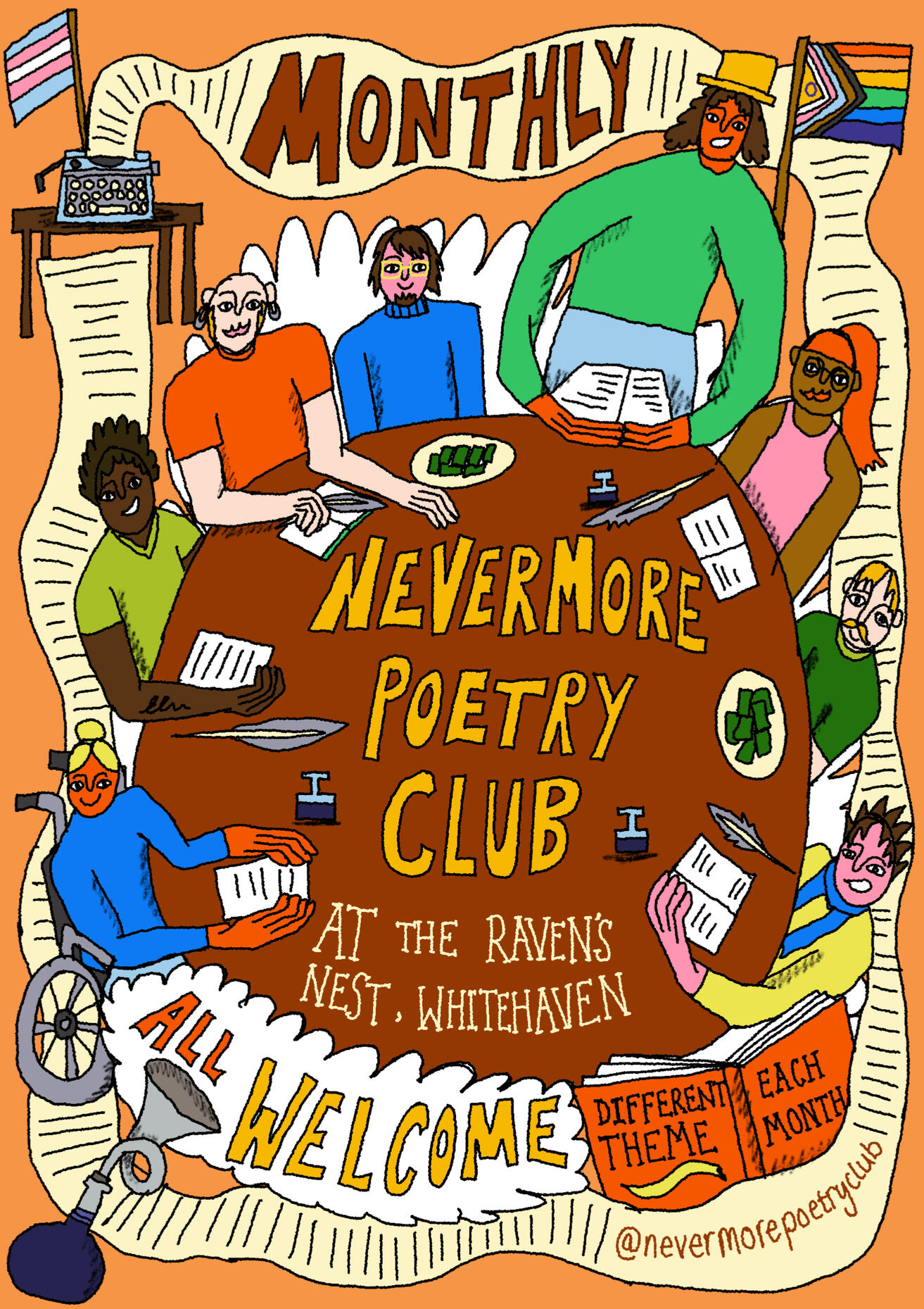
Nevermore Poetry Club
Poster
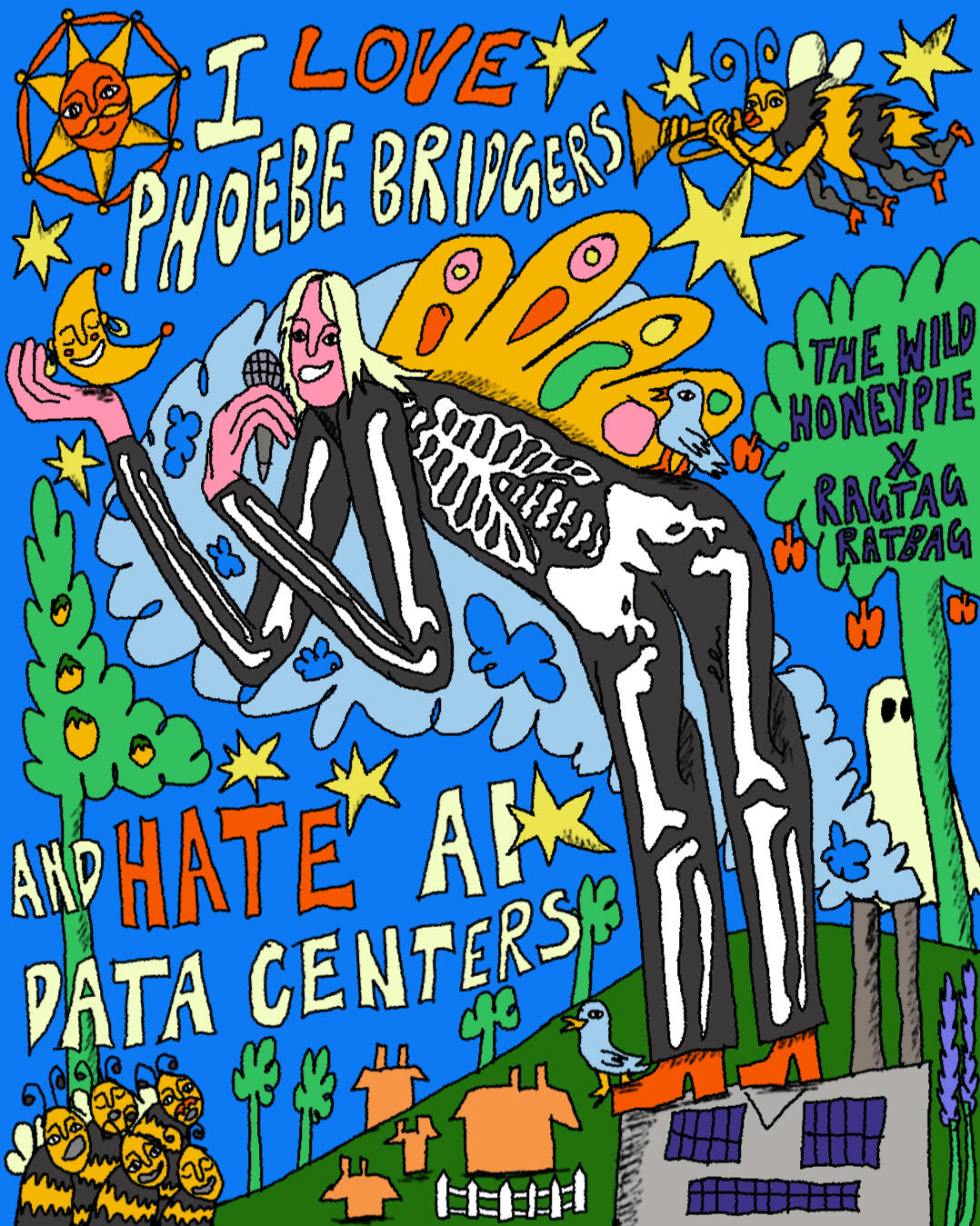
The Wild Honeypie
Instagram Asset
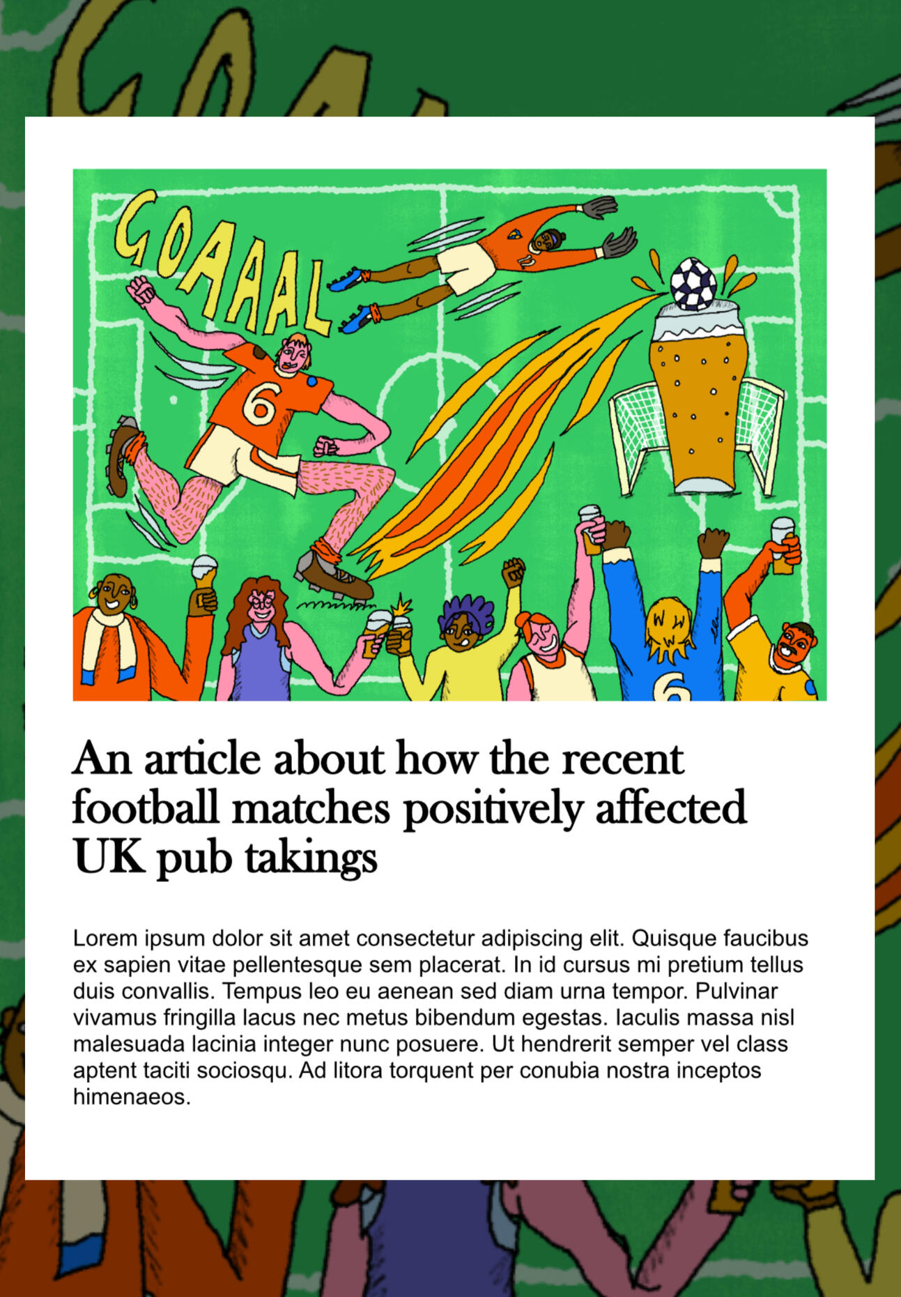
Football Illustration Mockup

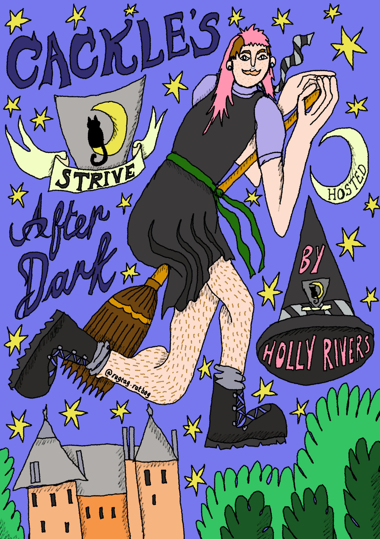
Cackle's After Dark
Podcast Poster

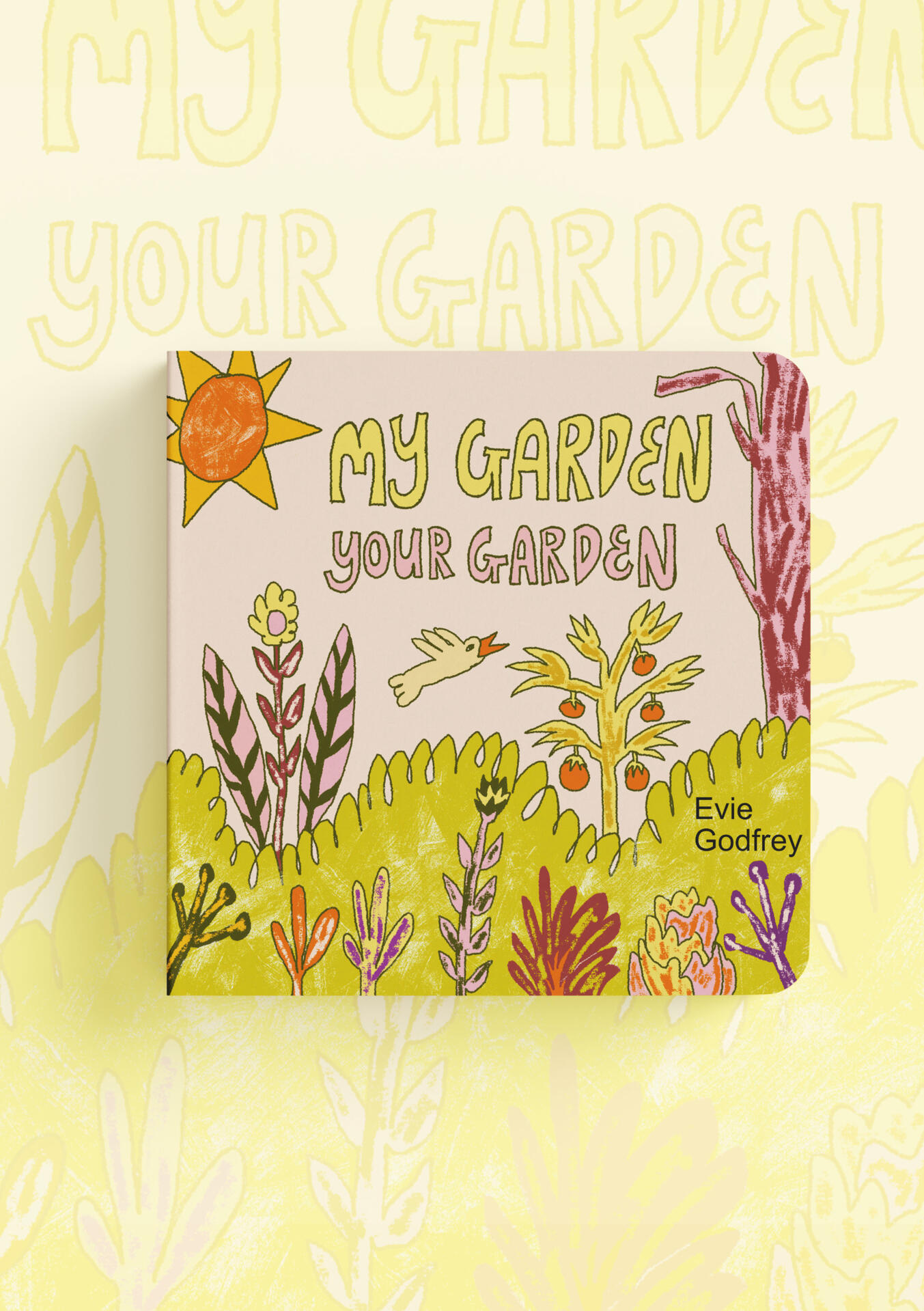
My Garden Your Garden
Children's Book Project
I Said Bread Bakery
Illustration
Illustrated Scarf

Sour Cucumber Party
Illustration

Feast on a Table Illustrated
Scarf Design
Sobar Alcohol Free Bar
Branding
Animals From Around the
World Book Cover Mockup
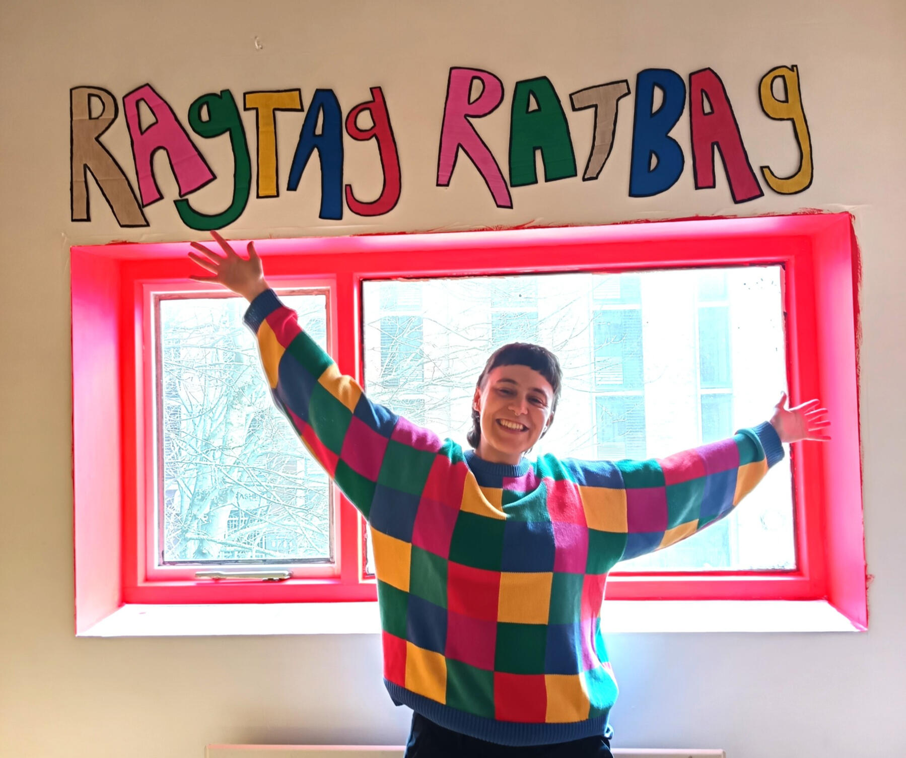
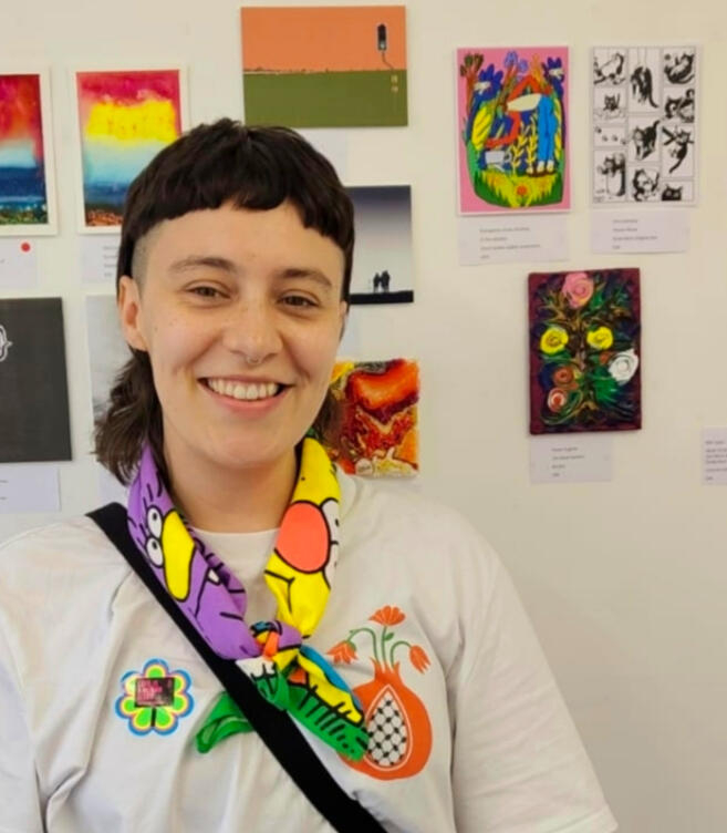
Hi! I'm Evie aka Ragtag Ratbag (she/ they/them). I'm a super-friendly, queer and non-binary Freelance Illustrator and Creative, based in Sheffield, UK.

I love bright, energetic colours and creating funny scenes with bendy, janky characters, animals or objects. My love of collecting secondhand bric-a-brac often inspires my illustration work, along with old children's books, vintage illustration and the world around me. There's inspiration everywhere, especially in flea markets and chazza shops!I'm passionate about LGBTQIA+ rights, the environment, activism, community and social justice. I'm an advocate for the equity and inclusion of lived experience, and a lot of my work is created through the lens of my own lived experience.
Have a look at my work and get in touch if you have any projects you'd like to work on together.Have a snazzy day!

Cheeky Cat

Cheeky Cat Greetings Card Illustration
This piece was a super fun personal project. My aim was to design a silly greetings card which would make people smile. My target audience was specifically people who know how hilariously cheeky pets can be. I was inspired by my own cat, who I caught drinking from the bathroom sink one early morning! This illustration is my best-seller to date (greetings cards and art prints)!

Image Credit: Yes! Definitely

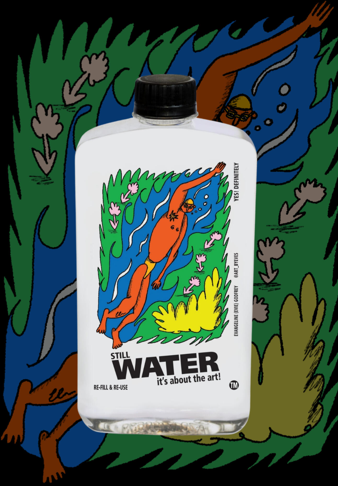
Yes! Definitely Water Bottle Label
I created this illustration for the South African water company 'Yes! Definitely', who work with artists to produce illustrated labels for their water bottles. I was thrilled to be chosen as the brand ethos (persuading people to reuse plastic bottles) means a lot to me.At the time my water bottle design was launched, I was the only creative outside of SA and the UAE that the company had worked with.I challenged myself to create a fun illustration that depicted what it felt like to be immersed in natural warm waters. I wanted to really evoke a sense of pure hydration!Click images to enlarge

Label Mockup

Me With My Bottle


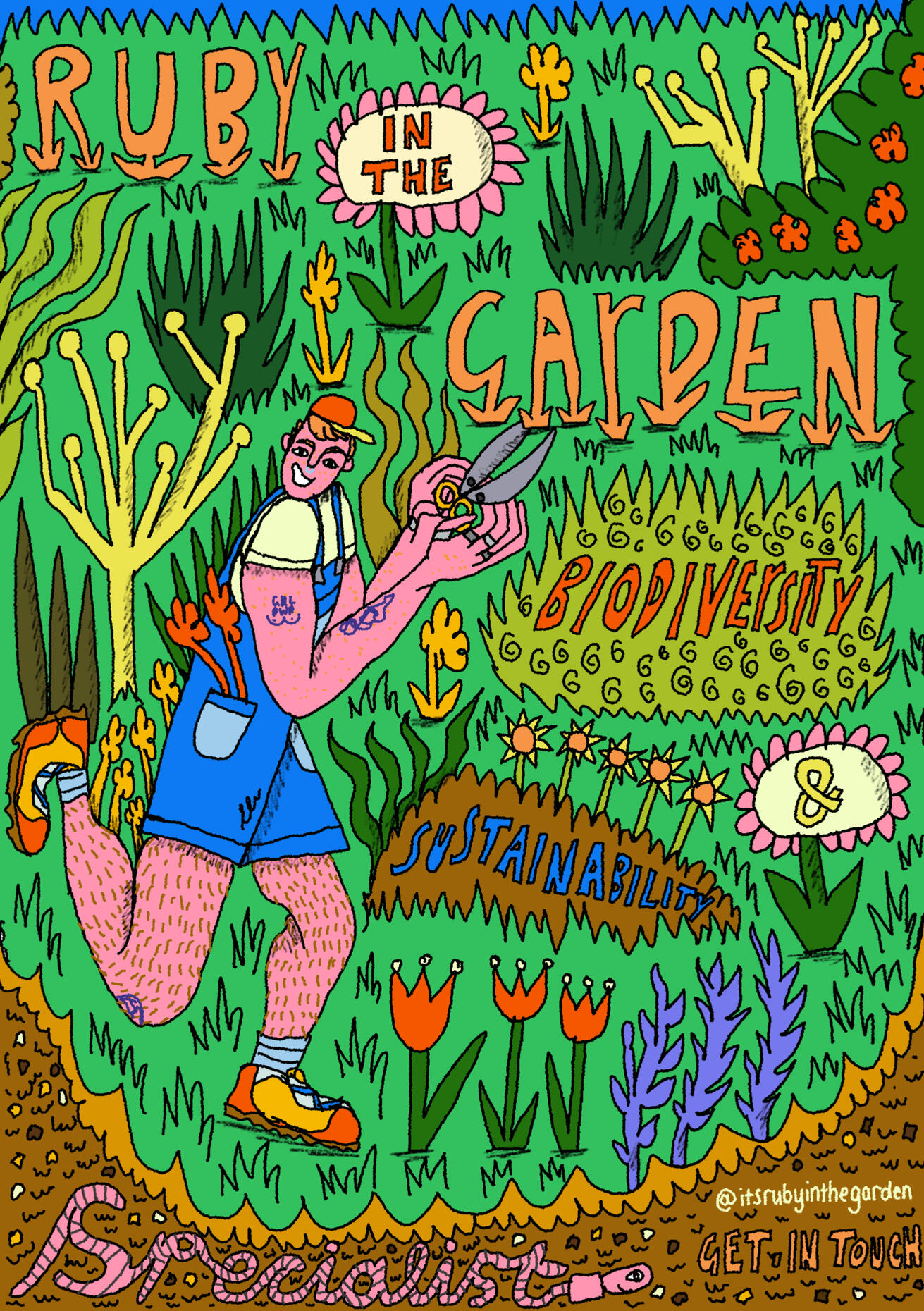
Ruby in the Garden

Ruby in the Garden Illustrated Poster
Ruby is a biodiversity and sustainability specialist who helps clients make their gardens better for the environment as well as for them. They reached out for an illustrated poster, to show people what they do. I wanted to keep it fun, busy and energetic, emphasising nature and biodiversity as well as capturing Ruby's essence and passion for their work. It was really fun to create some wonky illustrated lettering in this piece!Click images to enlarge

Linework

Moodboard


Make Wonky Art and Always Be Yourself

Off The Canvas Cafe Wall Mural
Off The Canvas Cafe in central Sheffield reached out and invited me to add my mark to their community mural room. This was my first attempt at a wall mural, and I loved it! I've had some epic feedback since finishing and loved the process of planning through to finishing my mural!There was no specific brief for this piece, but I wanted to showcase my style and some wonky, fun characters. My process began by thinking about the composition and layout, creating a digital sketch and then going for it on the wall- learning as I went along. Murals are something that I've wanted to get into for a while and I'm super excited to do more!

Digital Sketch Idea

Off The Canvas Story


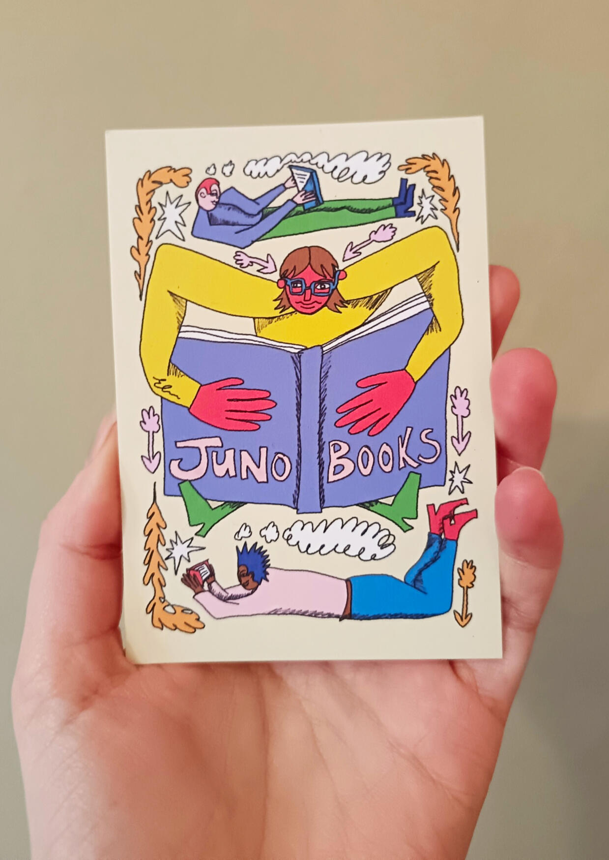
Juno Books Gift Card

Juno Books Gift Card Design
I was commissioned by Juno Books to create an illustrated gift card design for the front of their new gift cards. Juno is a queer-friendly, feminist, intersectional bookshop in Sheffield. I wanted the piece to really reflect the fun of being immersed in books that are inclusive and diverse. I was inspired by how magical books felt as a kid and how I was glued to them when I found one that really spoke to me.Click images to enlarge

Linework Sketch

Juno Digital Illustration


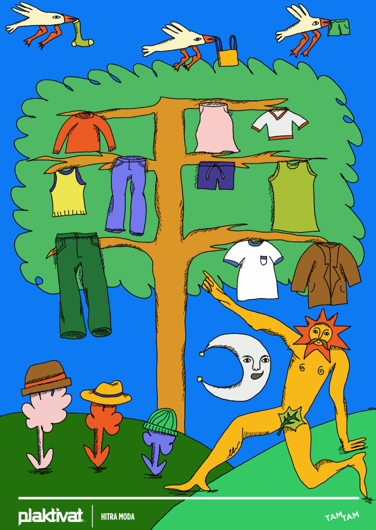
Make Better Choices

Plaktivat Poster Design- Make Better Choices
This was my submission to Plaktivat #18 (Posters That Change Society). The theme of #18 was Fast Fashion. My poster was awarded as a Finalist in the "Fresh Blood" category and was exhibited as a 50x70 poster in Slovenia, sponsored by TamTam (photo below).I titled my piece 'Make Better Choices' and chose imagery and a backdrop of nature to really hone in on how disconnected we have become from nature, especially in sectors like fast fashion. This created an interesting juxtaposition. I wanted the poster to make the viewer think about want/ need and the choices they can make when it comes to fashion consumerism.Click images to enlarge

Photo: Kreft Tadej

Plaktivat Award Certifcate


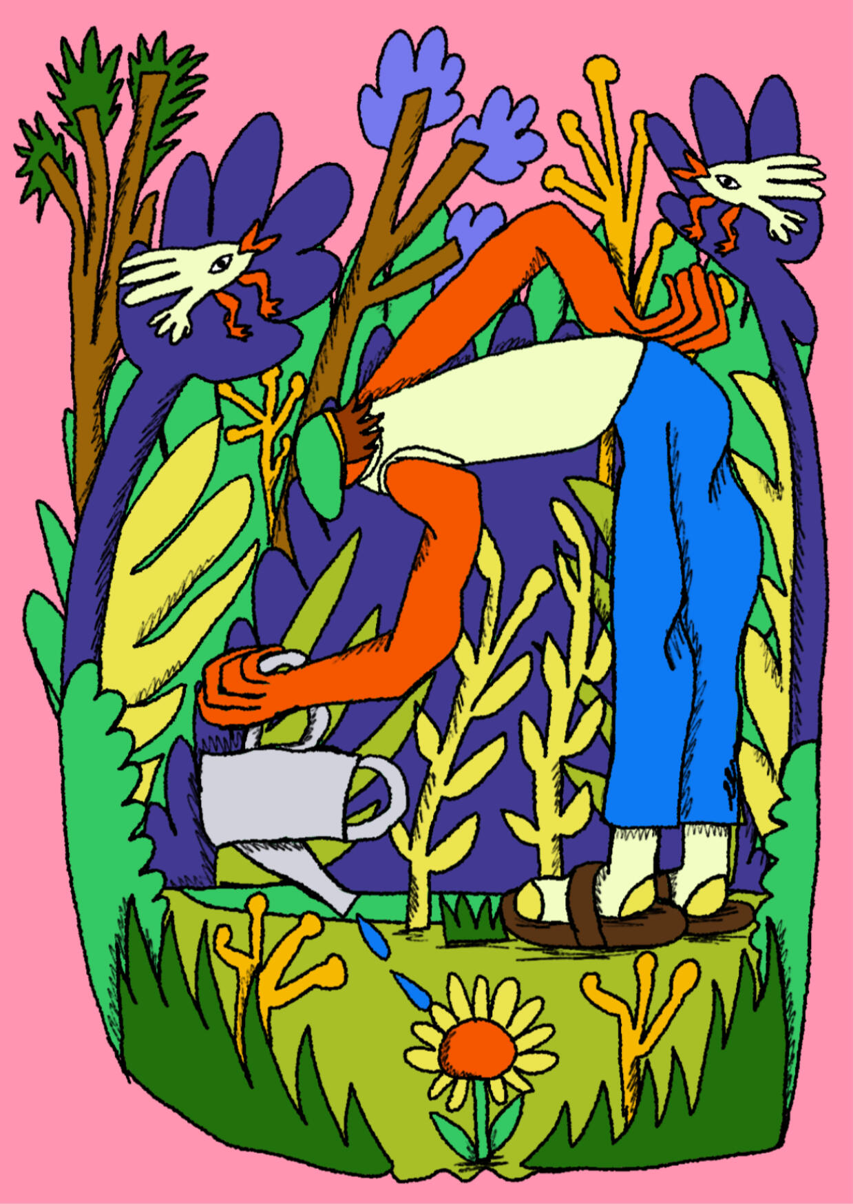
In the Garden

In the Garden Illustration
This illustration was showcased in Fronteer Gallery, Sheffield, in their 'Send Me a Postcard' exhibition (9-20th June 2026).With this piece, I wanted to depict what it felt like to be enveloped in my wild, bushy garden. I love spending time in my garden and wanted to translate this lovely everyday moment into a piece that others could feel too.Click images to enlarge

Exhibition

Hairdresser Illustration Redone

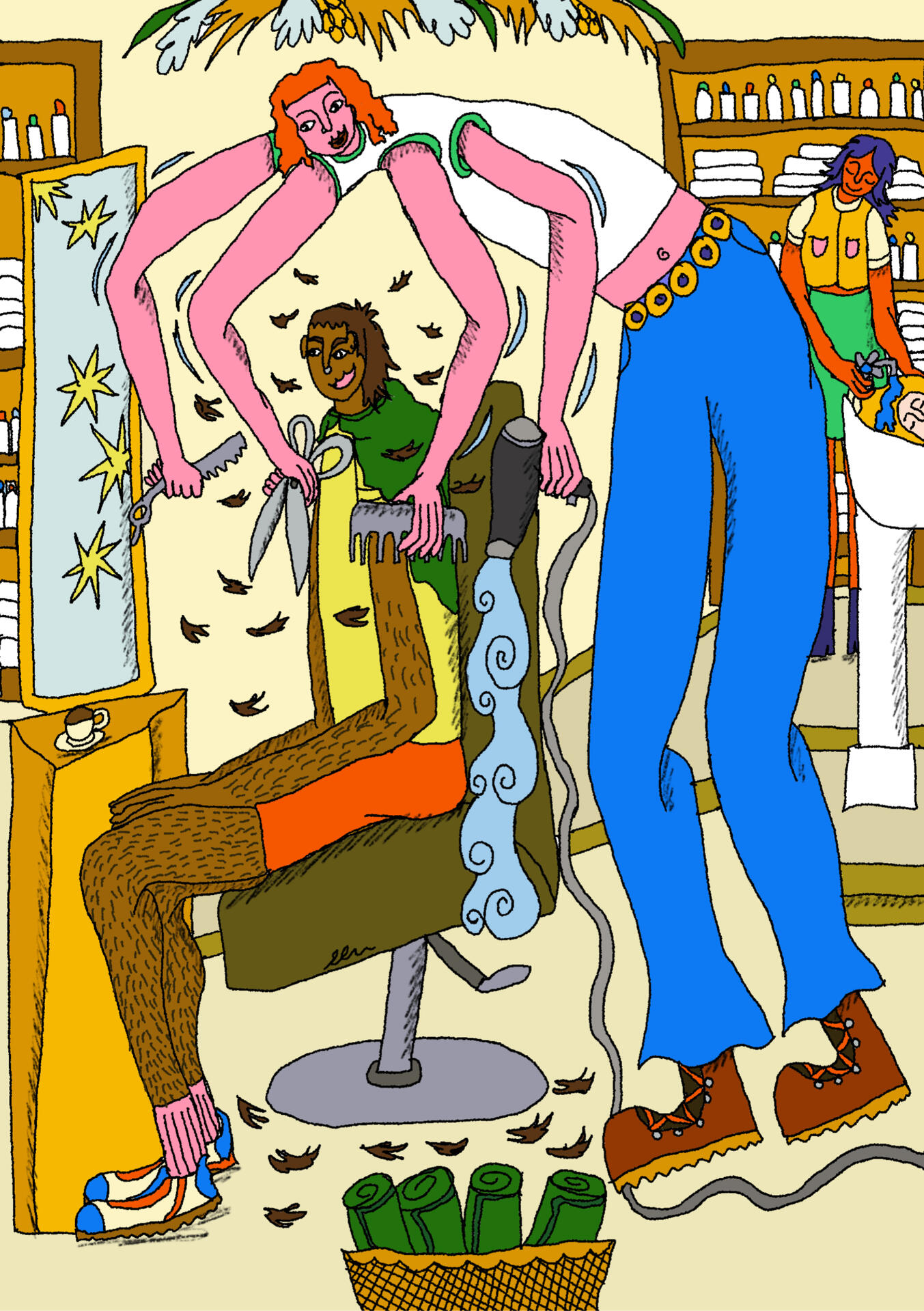
My AOI mentor tasked me with redoing this original image that I created a while ago for a local hairdresser, showcasing how I currently work and how my style has evolved. In the redo, I wanted the illustration to be more diverse and I wanted to visually show her working really fast, giving the new work lots more energy and dynamism.
Illustration for Hairdresser- That Emelya Does Hair
This was originally an illustration that I created for a sustainable, queer-friendly and inclusive hairdresser- That Emelya Does Hair. Emelya gave me my first mullet haircut, so the original scene is depicting that and how snazzy I felt when she'd done the cut. Emelya is bubbly and full of energy. She works really fast (often cutting hair with a razor!) whilst holding the best conversations about anything and everything.Click images to enlarge

Original 2025 Illustration


Updated Illustration

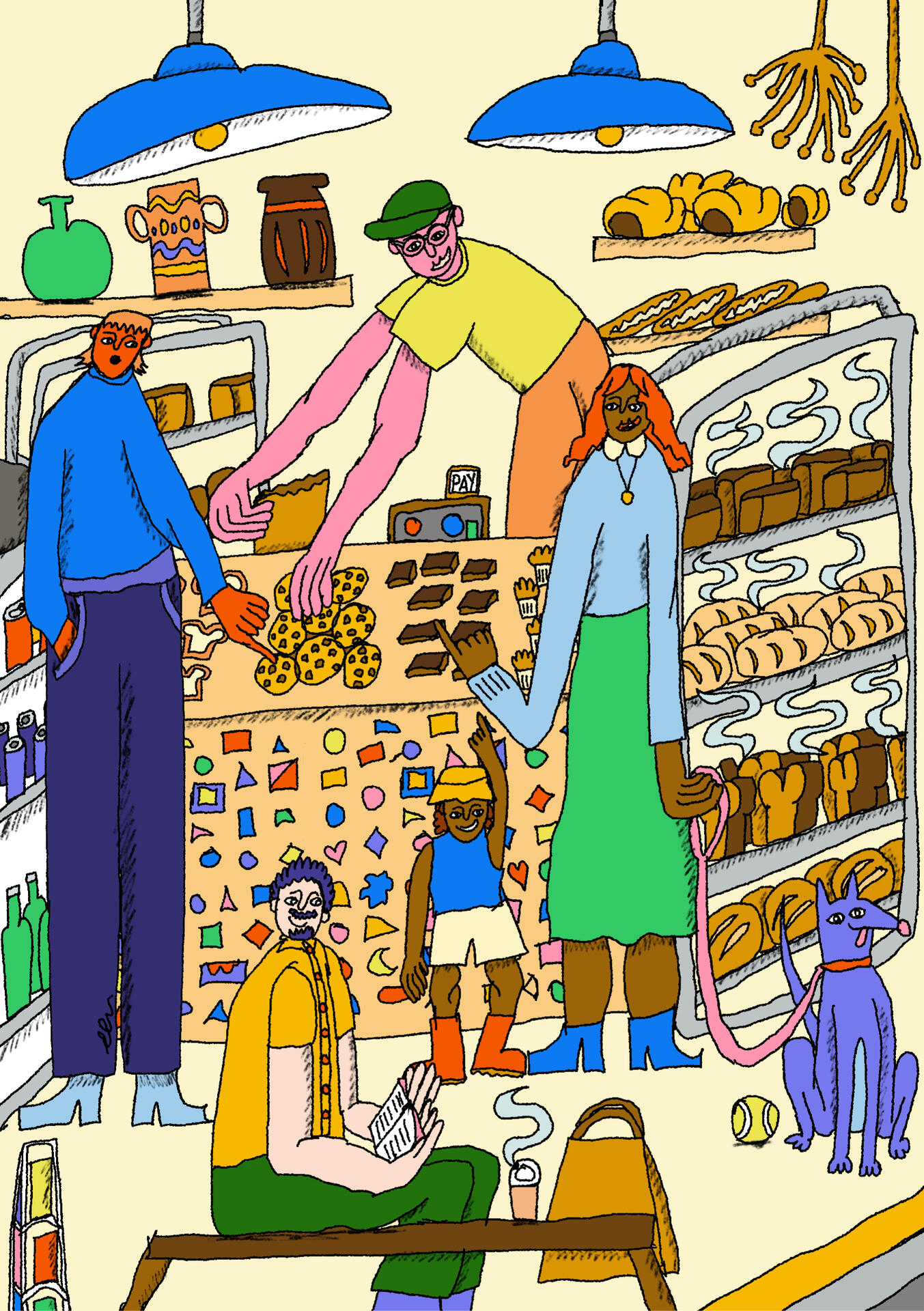
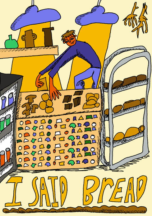
I Said Bread Bakery Illustration
Remake of an illustration I created for I Said Bread in 2025. I wanted to portray all the little elements that made it our local bakery, including the colourful stickers on the counter, being surrounded by baked-goods and works by independent local makers. It always gives me a warm feeling when I walk in.My AOI mentor tasked me with updating my original poster to showcase my evolving style and how I currently work. I always felt that the busy vibes of the bakery were missing in my original piece, so I focused on that in my remake.Click images to enlarge

Scarf Mockup

Illustrated Scarf Mockup
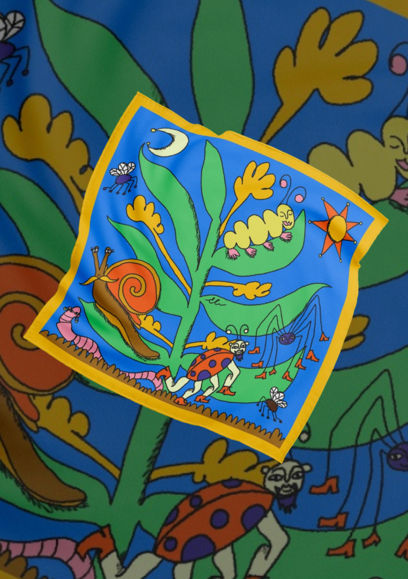
This was a super fun, self-directed project. I absolutely love Lush knot wrap scarves and have a fab collection which I often wear. I made a mockup of one of my illustration on a scarf as I wanted to put myself out there to brands like Lush, that I super admire for their ethos and stance on social justice!I call this illustration 'Neighbourhood bugs' and was inspired by communities in nature living in symbiosis.Click images to enlarge

Illustrated Scarf Design

Evie Holding the Scarf


City by Night

City By Night Illustrated Poster
I created this poster for an open call competition called PLAKATropolis. I felt inspired by the vibrancy and aliveness of my fav cities at night (London, Gdansk, Berlin). I imagined different posters becoming part of the buldings. I love the dynamism and visual tension in this poster!
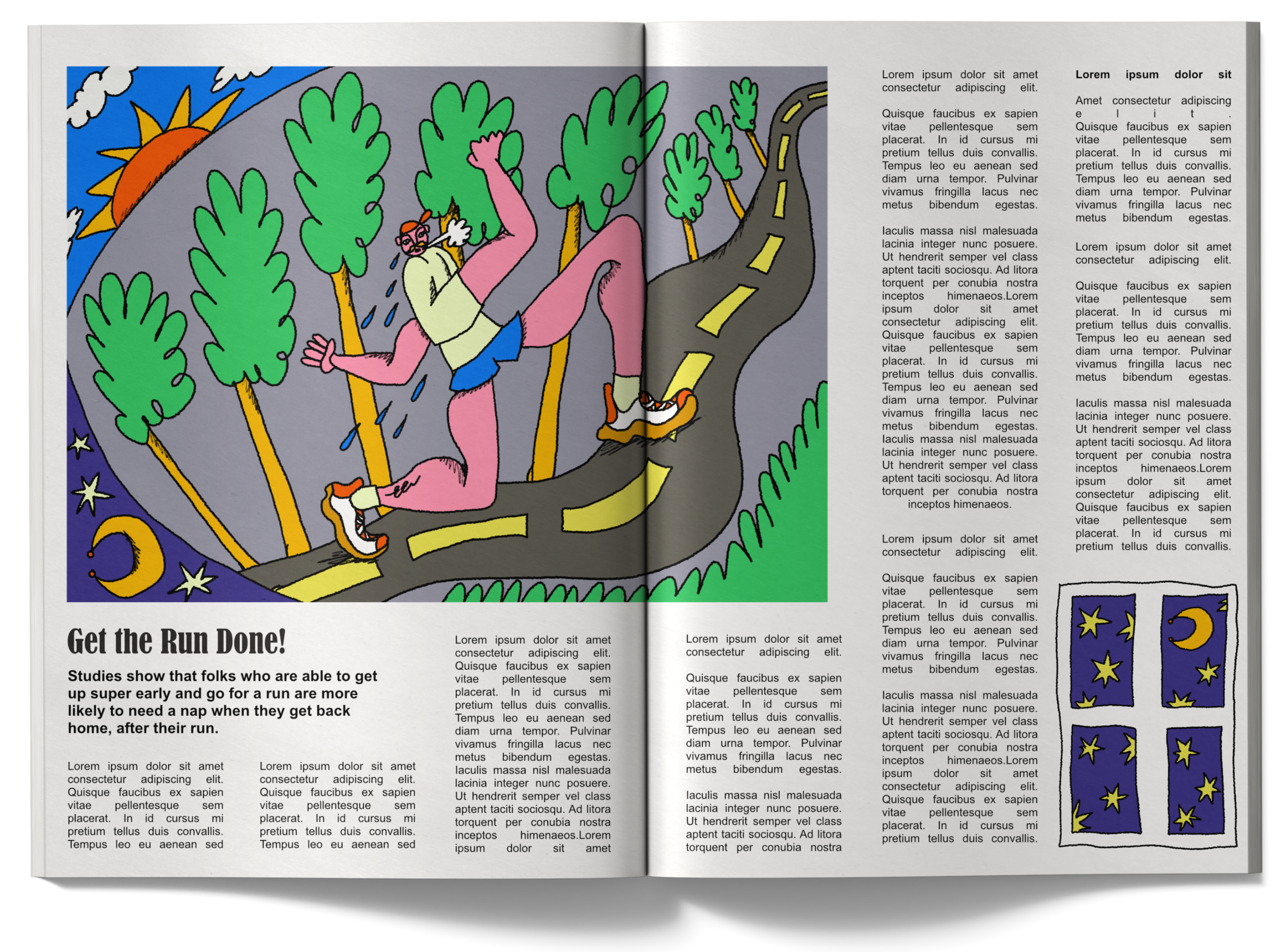
Early Morning Run Illustration
I wanted to create this piece to depict an early morning run (changing from night to day), showing movement and directionality. I thought this piece would work well for editorial so I bobbed it in a mockup. Personal work.Click images to enlarge

Initial Sketchbook Sketch

Final Digital Illustration


Editorial
A snazzy collection of editorial mockups and projects so you can see how my work looks in print etc!

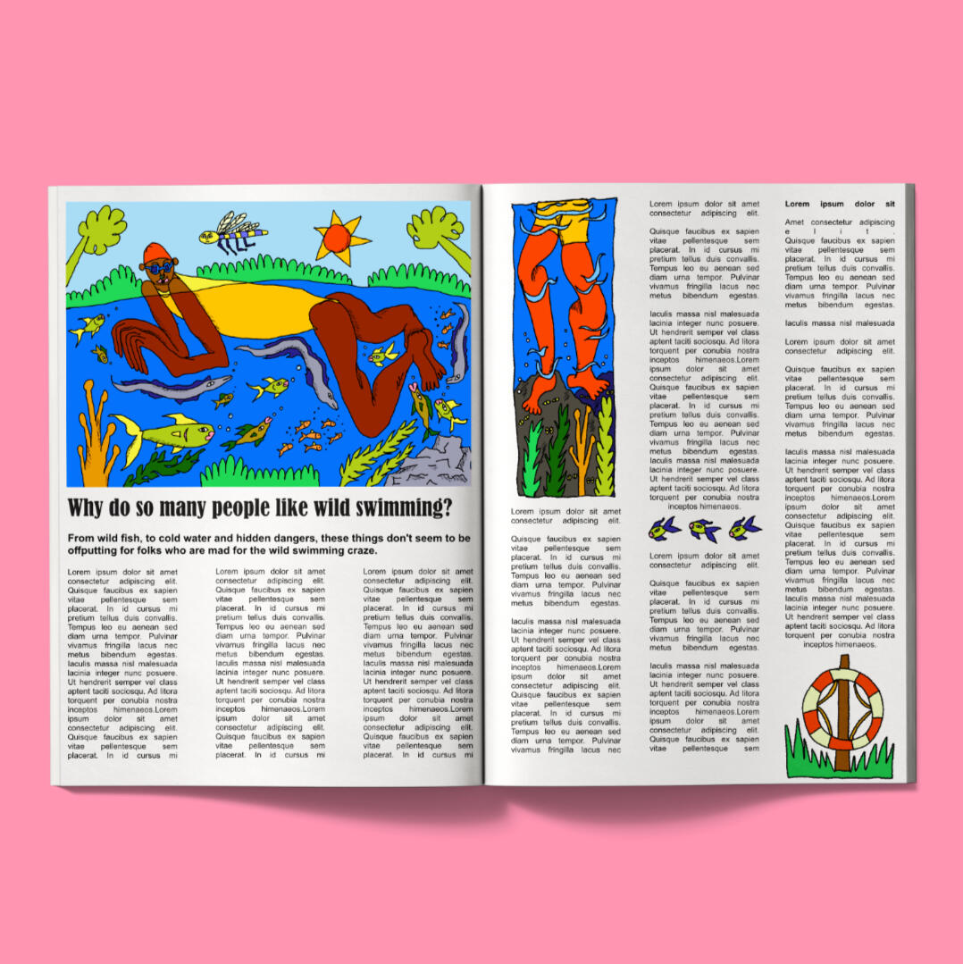
Wild Swimming

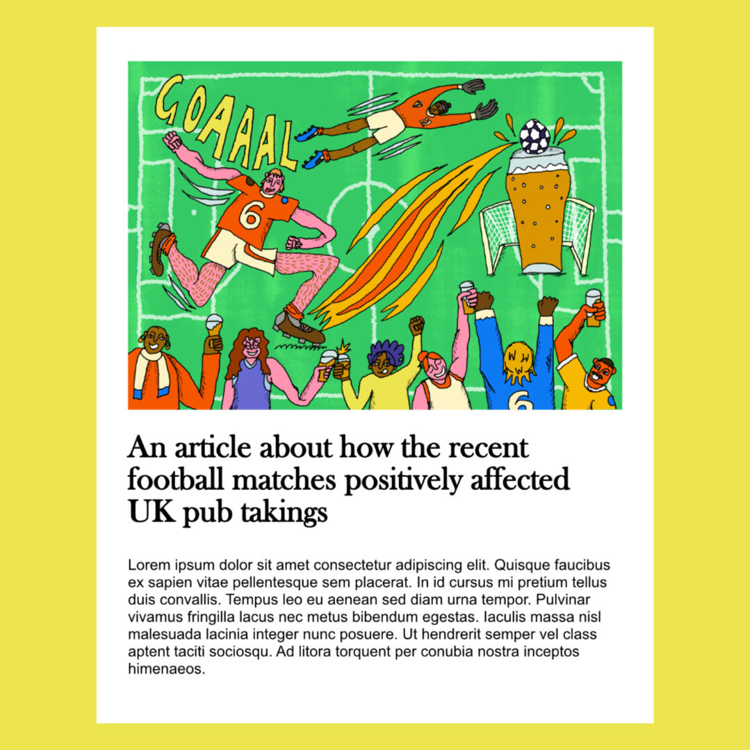
Football and Pubs Article

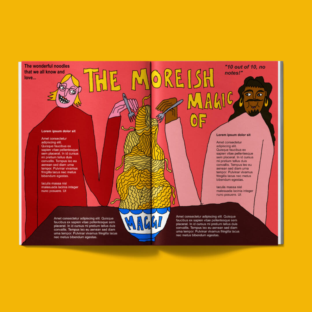
Moreish Magic of Maggi Noodles

Garden Grubs

Local Markets

Get the Run Done


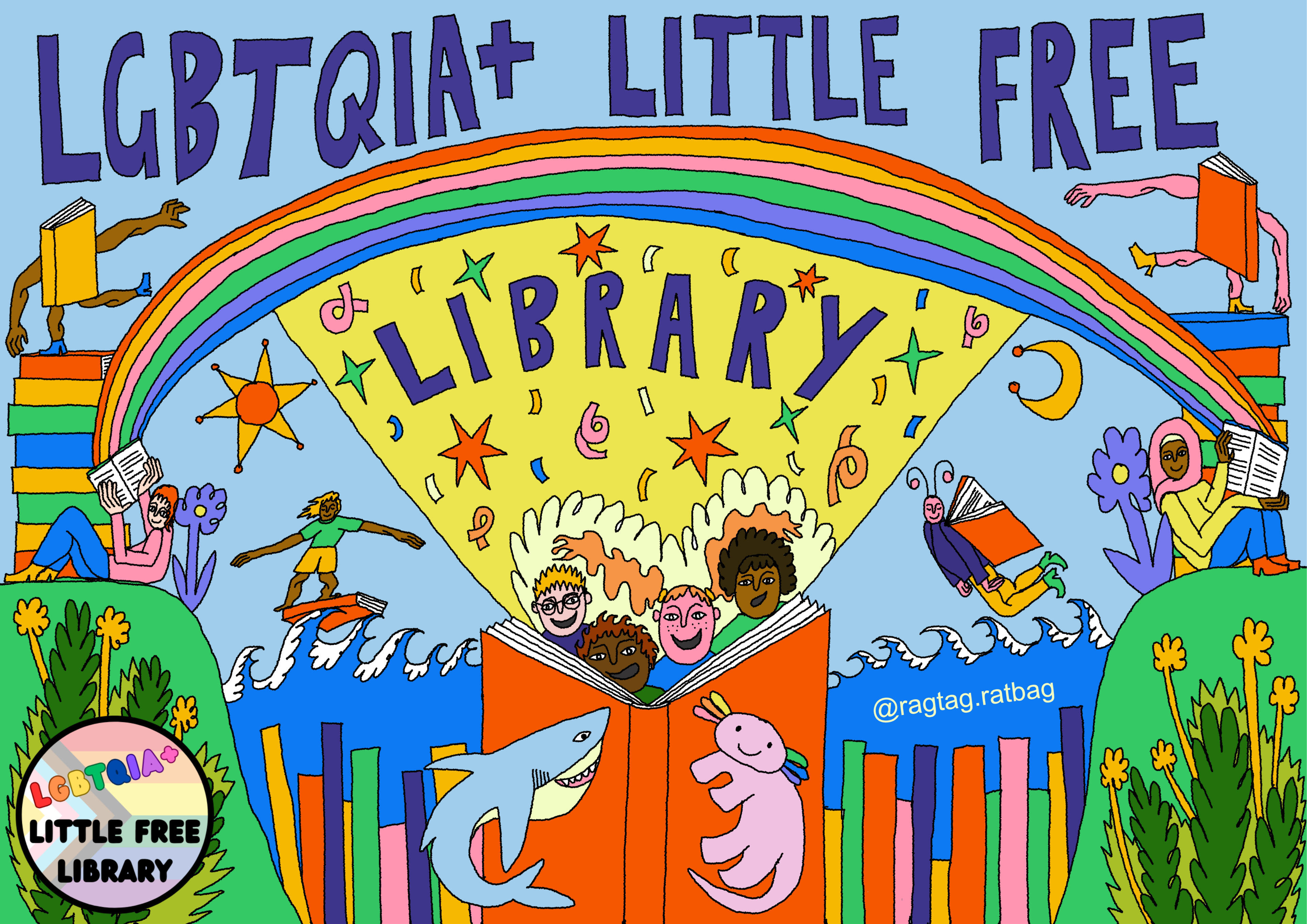
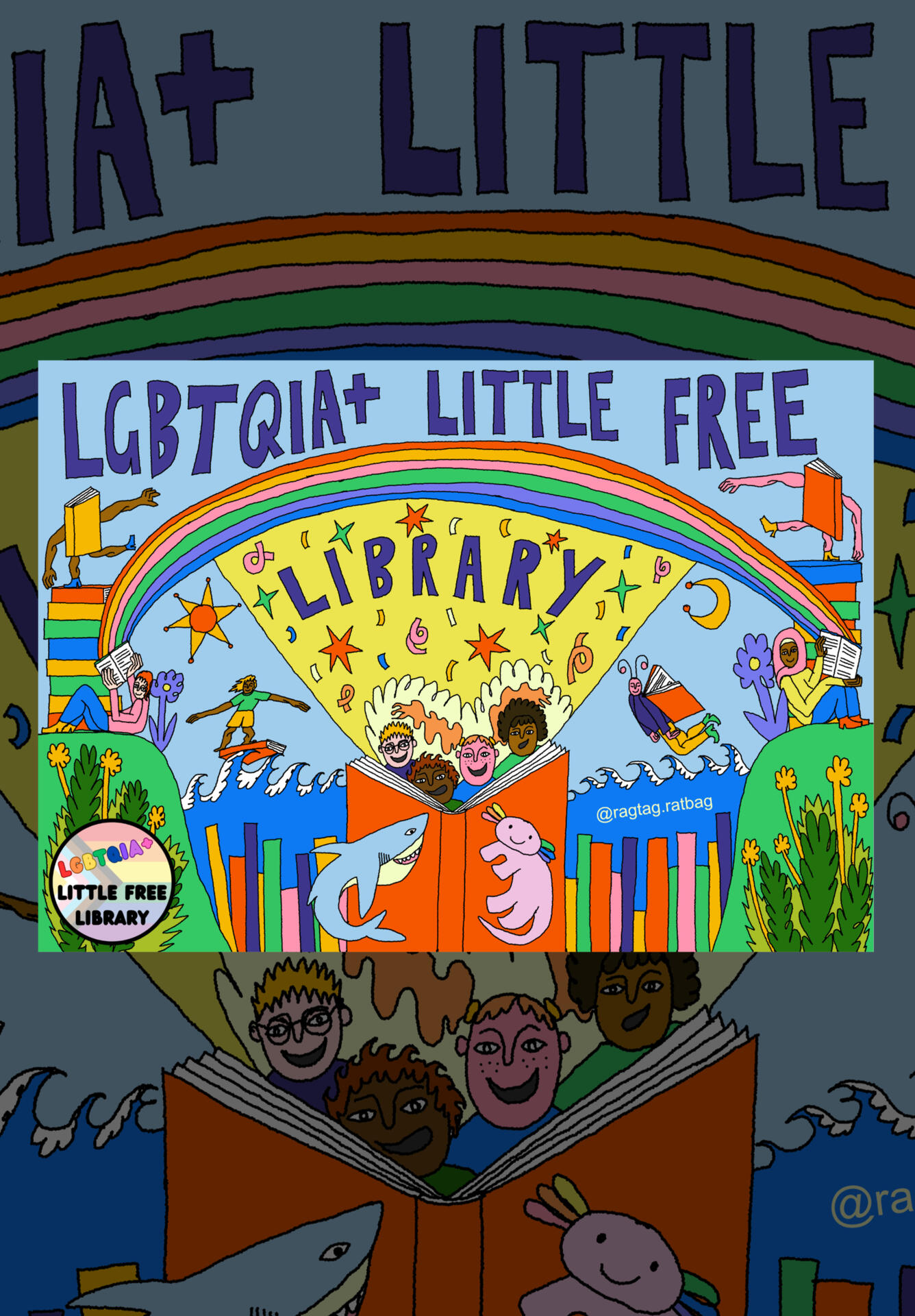
LGBTQIA+ Little Free Library Illustrated Sign
An illustrated sign that I created for LGBTQIA+ Little Free Library. They are a small mobile library providing LGBTQIA+ books to children and young people in Bristol and South Glos. The brief was open, but prompts included: ''reading, rainbows, Shark and Axolotl plushes". I had a lot of fun making this sign, I wanted it to feel energetic and encapsulate the excitment of getting lost in a book as a child!Click images to enlarge

Photo of the Printed Sign

Photo of the Sign in the Library


Photos courtesy of LGBTQIA+ Little Free Library

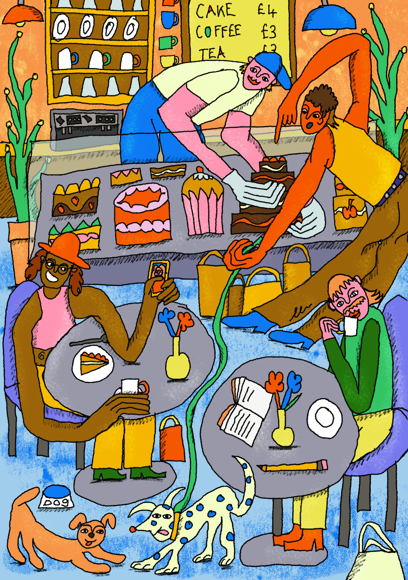
Mid-Afternoon in the Cafe

Mid-Afternoon in the Cafe Illustration
I wanted this piece to depict a busy cafe at mid-afternoon. I focused on interesting composition and wanted the viewers eyes to find lots of smaller details the more they looked. Personal work.In July 2026, this piece was featured on Brillo Magazine's Instagram feed!Click the image to enlarge

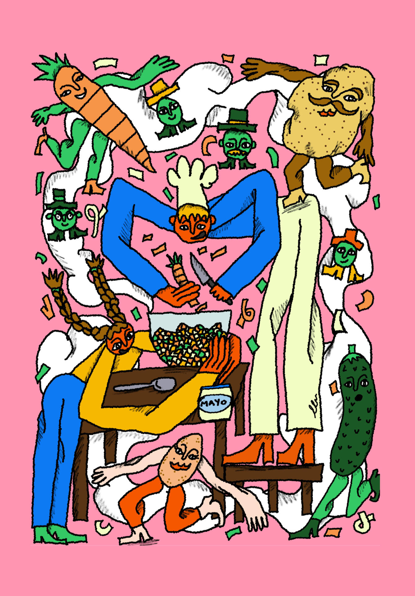
Kitchen Chaos

Kitchen Chaos: Making Salad Illustration
In response to the callout from Pictoplasma Balkans, entitled "Characters and Their Food". This illustration was inspired from visiting family in Poland and the chaos of making a giant bowl of Sałatka for family gatherings (peeling heaps of veg and veg flying everywhere)!Chosen for exhibition at Pictoplasma Balkans 2026. The festival runs from 18-20th Sept in Varna, Bulgaria but the exhibition will take place at ReBonkers in Varna, 17-27 Sept.Click the image to enlarge

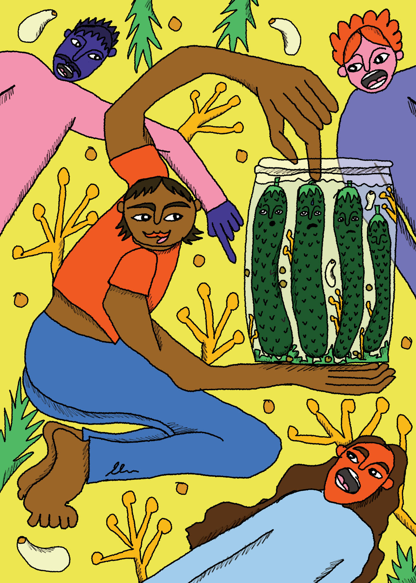
Sour Cucumber Party

Sour Cucumber Party Illustration
In response to the callout from Pictoplasma Balkans, entitled "Characters and Their Food". I wanted to have fun with this one, really focussing on the characters expressions to depict a humerous scene.Chosen for exhibition at Pictoplasma Balkans 2026. The festival runs from 18-20th Sept in Varna, Bulgaria but the exhibition will take place at ReBonkers in Varna, 17-27 Sept.Click the image to enlarge
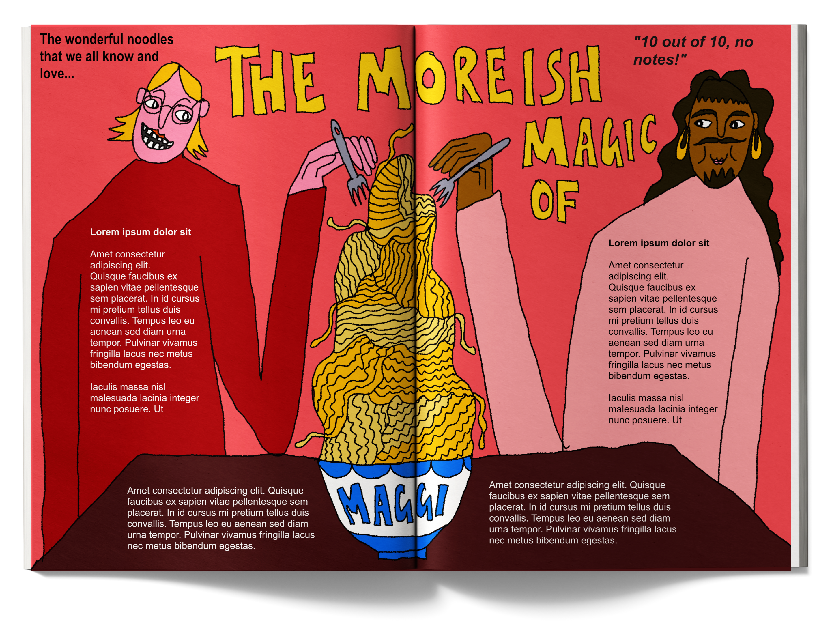
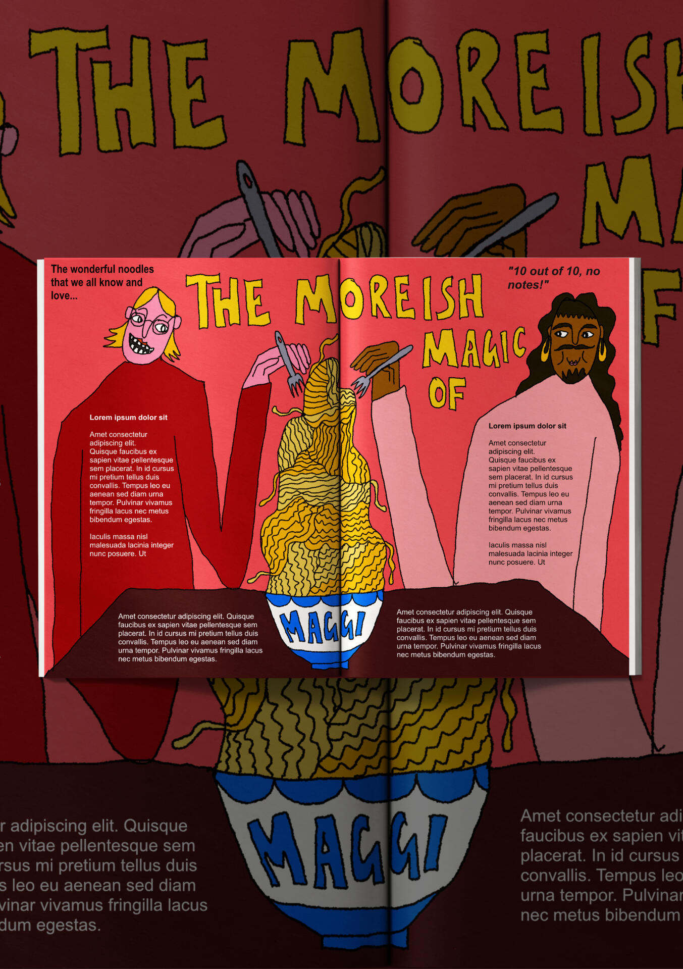
Moreish Magic of Maggi Editorial Mockup
Response to a brief by Pit Magazine on The Editorial Illustrators Playbook course by Inky Goodness Collective. Maggi noodles are so nostalgic for me, so I wanted to depict a Maggi feast and two people enjoying the mountain of noodles. Personal work.Click images to enlarge

Linework Sketch

Final Illustration


I love Phoebe Bridgers and hate AI data centers

The Wild Honeypie Instagram Asset
This illustration was commissioned by The Wild Honeypie, who connect musicians, chefs, fans, filmmakers and brands. The brief was open, as they wanted me to capture the illustration in my style, but guidelines were that it must include a bee (their brand mascott), the line "I love Phoebe Bridgers and hate AI data centers" and some Phoebe Bridgers Easter eggs. Can you spot them?Click the image to enlarge

Illustrated Poster

Nevermore Poetry Club Poster
This illustration was commissioned by Nevermore Poetry Club. They wanted a poster which showed the diverse, relaxing, friendly, creative nature of their club. I tied in lots of small elements that mean a lot to the club, including writing quills, the blue typewriter, the bike horn and some plates full of stuffed vine leaves! I wanted the poster to appeal to a diverse audience and persuade folks to drop by and give the club a go!Click the image to enlarge

Illustrated Poster

Cackle's After Dark Podcast Poster
This illustration was a collab between Ragtag Ratbag and Cackle's After Dark podcast, hosted by Holly Rivers. The podcast is about Holly's time on set of the 1998 hit show "The Worst Witch". Holly asked me to illustrate the podcast logo in my signature wonky style and we decided upon the poster content together. The poster shows Holly's character as her character 'Drusilla' but with Holly's current hairstyle... a pink mullet!Click the image to enlarge
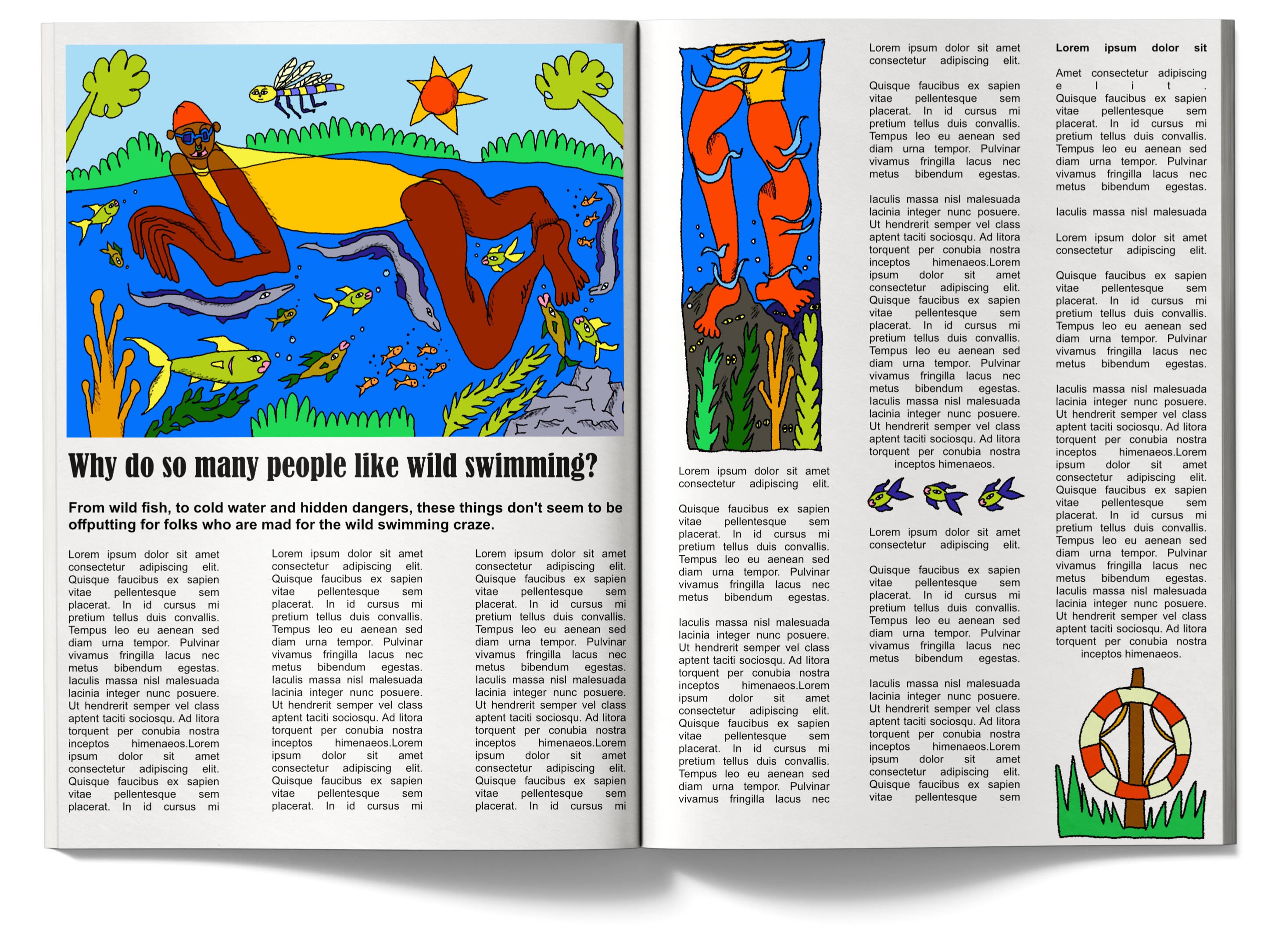
A Dip in the Pond Editorial Mockup
Personal project which was inspired by a heatwave and the amount of people I saw on social media going wild swimming. I wanted to capture a humerous moment, definitely something that would happen to me if I were brave enough to ever try it!

Illustrated Portrait

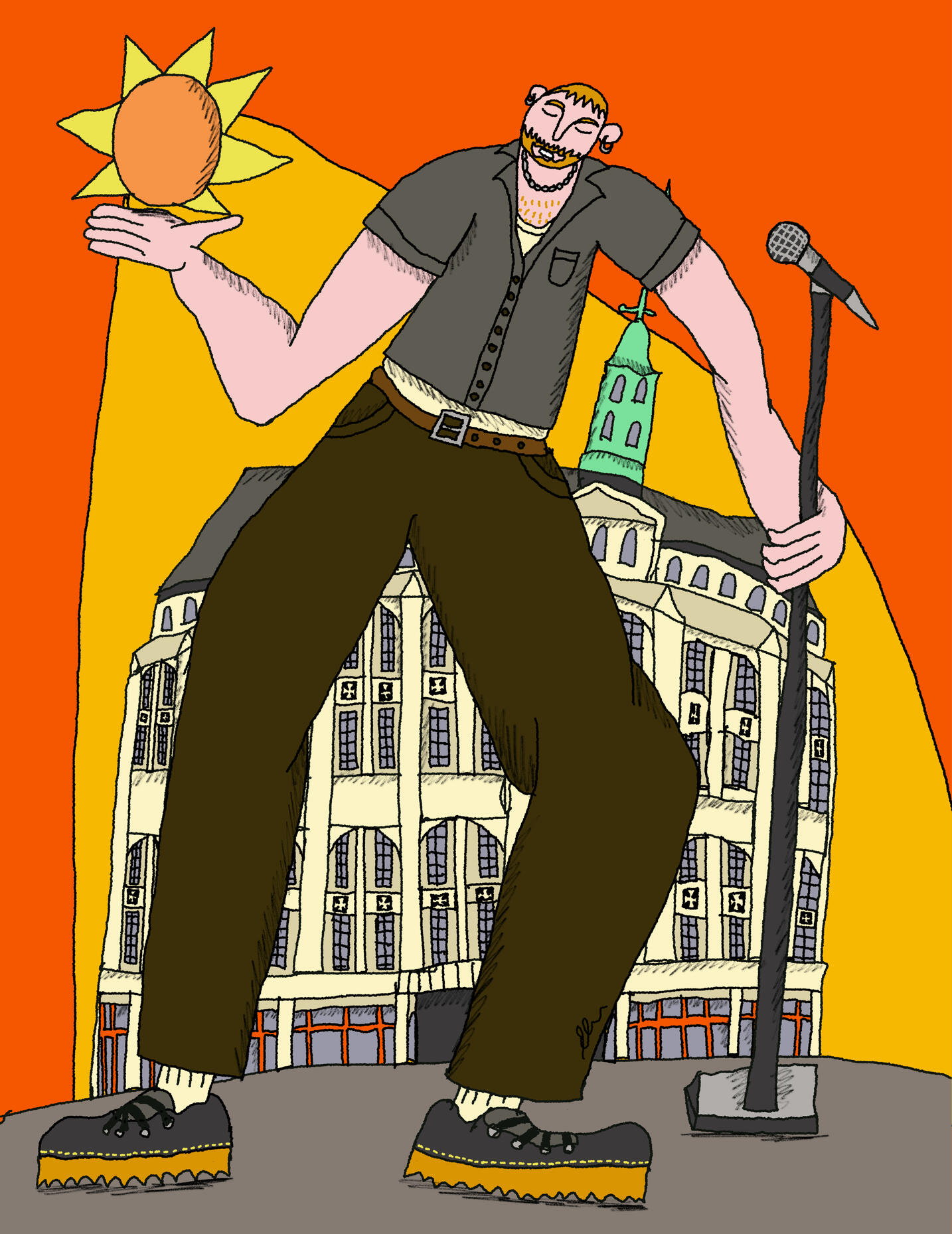
Kae Tempest Portrait for Loud and Queer Project
This illustration is a heartfelt portrait of Kae Tempest, with the background depicting 'Sunshine in Catford' (the title of one of his songs). I'm really proud to contribute to Loud and Queer Project, which pairs illustrated portraits of queer people with articles about them, also writte by members of the queer community."Loud and Queer is an online platform dedicated to sharing the stories of inspiring LGBTQ+ individuals and their contributions from around the world."

Screenshot of the article


Illustrated Mockup

Football and Alcohol Article Mockup
I tasked myself with creating an illustrated mockup for an existing online article for this piece. I wanted to push myself out of my comfort zone, so chose something a bit less familiar to me... football and alcohol.The article was about how the recent football matches positively affected UK pub takings.I wanted the piece to be full of energy, cheer and dynamism. I'm not a football fan myself, but love how it brings folks together, which is a common theme in my work!Click images to enlarge

Full Illustration


Illustrated Cover Mockup

Internal pages mockup

Internal pages mockup


Your Garden My Garden Children's Book Project
This project was part of my BA Hons Visual Communication coursework. The brief was to create a short lift-the-flap book for children (aged up to five years).I wanted my book to be low-stimuli, but fun and engaging, as well as having an important meaning behind it- teaching children that our planet belongs to all of us, not just humans.Click images to enlarge

front cover

page 1
page 2
page 3
page 4
page 5
page 6
page 7

page 8
page 9

page 10
page 11
page 12
page 13
page 14

back cover


Illustrated Scarf Design

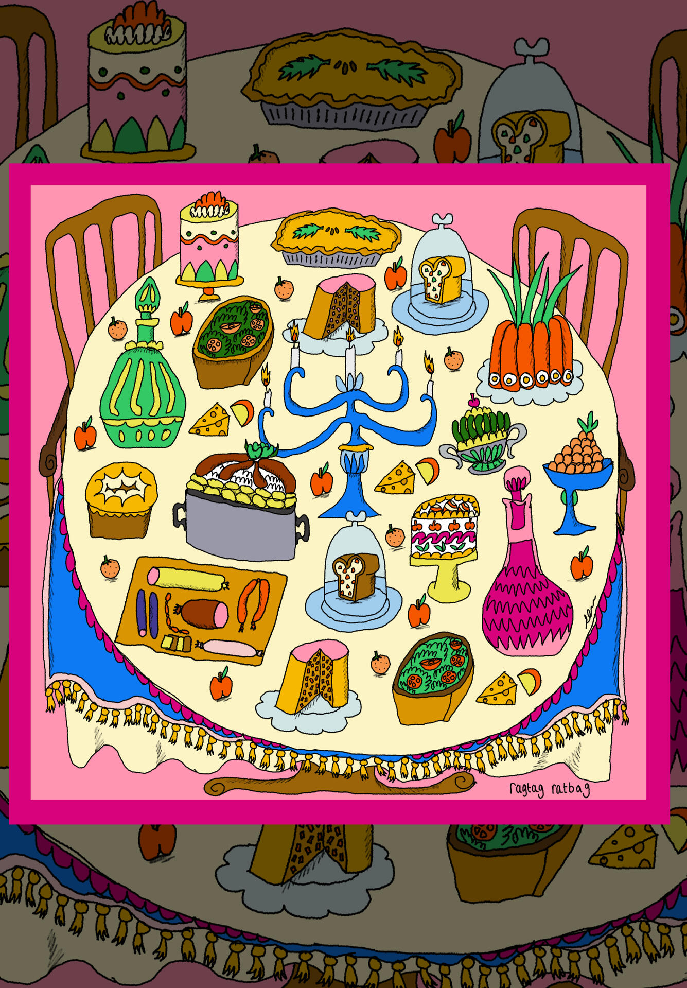
Feast on a Table Illustrated Scarf Design
I've been wanting to illustrate food for a while, so I decided to depict a fun little feasty table for my latest scarf design.I had soooo much fun creating this illustration and this scarf sold super quickly at a market after launching it.Need some wonky food illustrations, that have character and personality? I'm your person!

Evie holding the cotton scarf


Sobar Branding

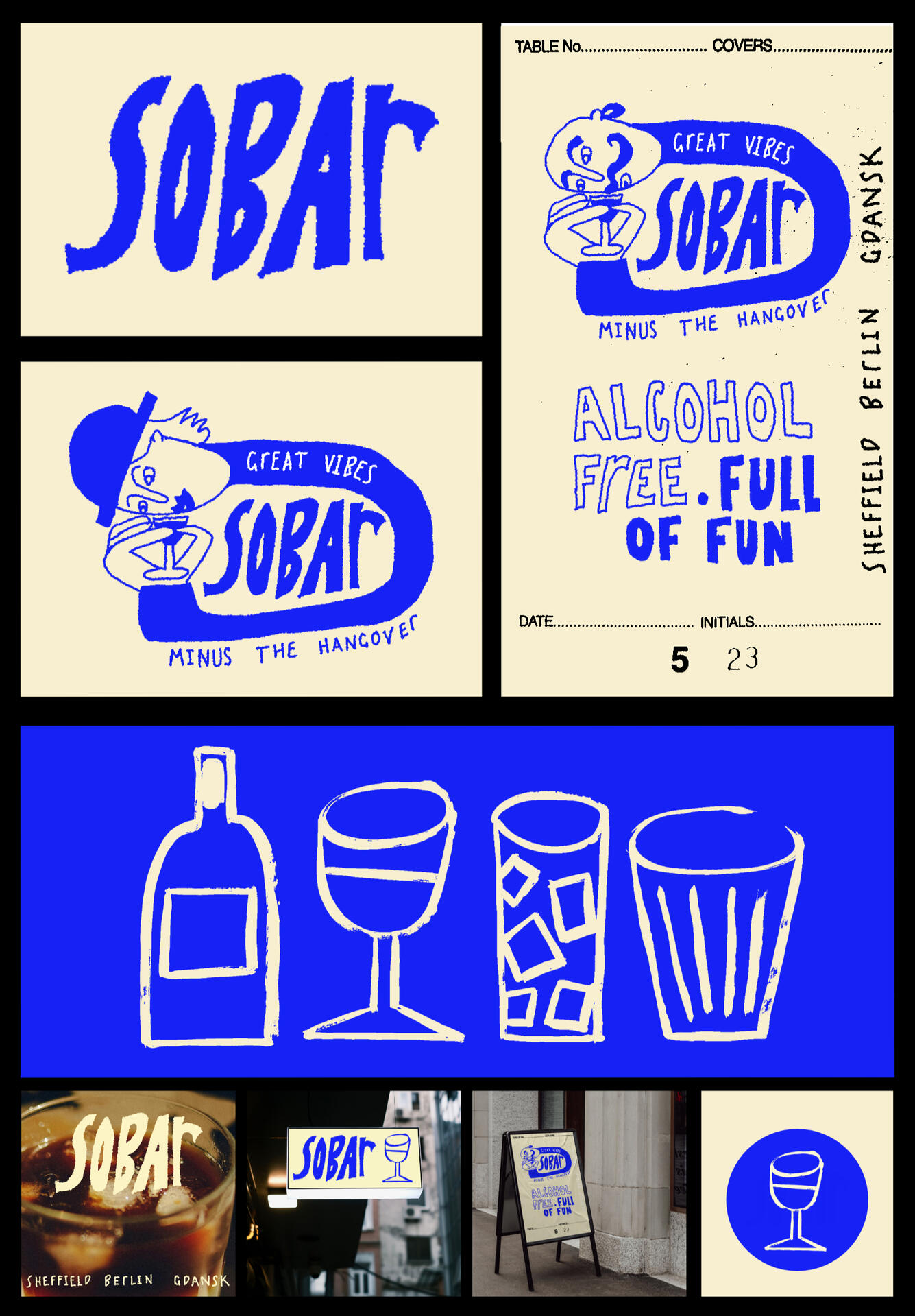
Sobar Alcohol-Free Bar Branding
This piece was created for my VisCom BA Hons project. The brief was to create branding for a new sober bar in three cities of my choice.I wanted the branding to be fun, hand-drawn and full of character. I thought this would appeal to young adults who want to go out and have experiences without alcohol.I used a mix of digital illustration and painting to create the illustrated assets.Click images to enlarge

Digital illustration

Process of painting the illustrated assets


Sobar Branding

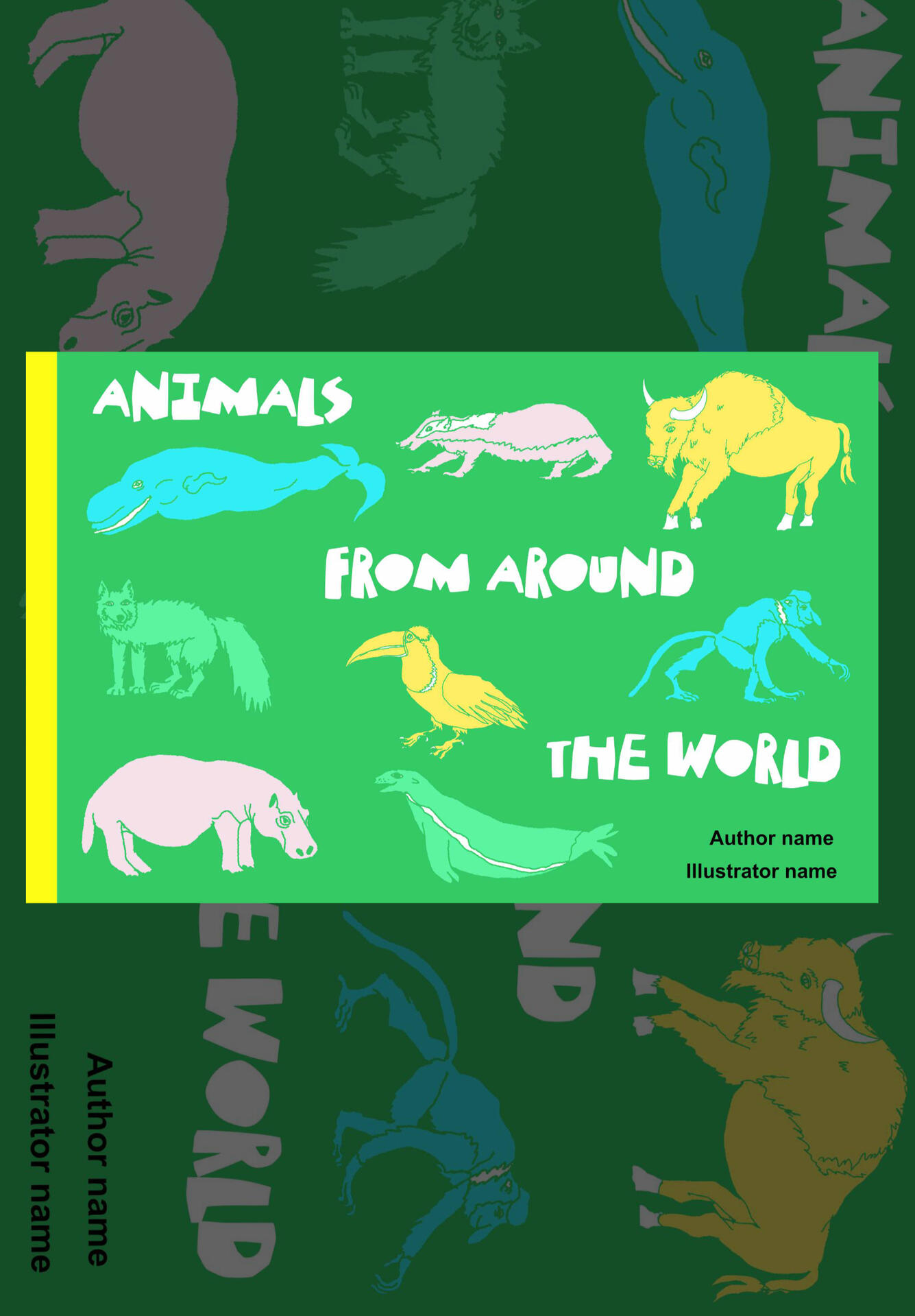
Animals From Around the World Book Cover Mockup
This piece was created for my VisCom BA Hons project. The brief was to design a book cover for a children's natural history book.There is a long history of covers for children’s reference books and these styles have changed over the years, but people have become used to what this type of book
usually looks like.My response to this brief thought about a modern audience and how I could attract children to the book using colours and my contemporary illustration style.Click images to enlarge

Cover one

Cover two

Cover three


